

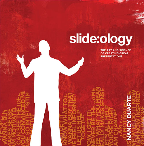
I don’t usually do book reviews, but I figured I’d give it a go and see if readers find it useful. And since I read Nancy Duarte’s slide:ology: The Art and Science of Creating Great Presentations recently, I figured: why not start with this book? This might seem an odd book selection for me as a writer and editor, but I’ve been working to build my speaking platform and reach bigger audiences lately. The book is actually a good fit for my needs right now.
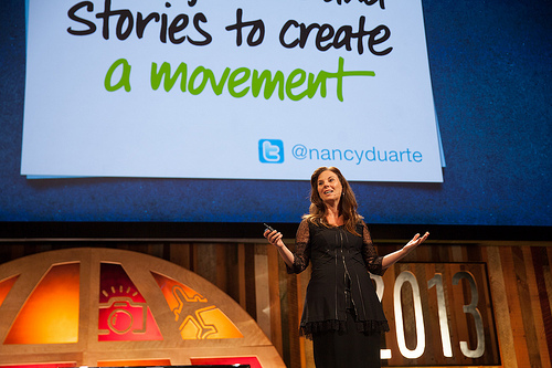
The book is written to create a “new slide ideology” and teach people how to avoid “career suislide” through bad presentations. Duarte is principal and CEO of Duarte design, the firm that designed the presentation for Al Gore’s Oscar-winning film, An Inconvenient Truth. slide:ology includes dozens of examples of her firm’s work, illustrating real-life application of the principles. It also features case studies to show the concepts in action.

The author’s firm designed the slides for Al Gore’s famous documentary
While many of Duarte’s tips and techniques are more useful for change agents and high-powered executives than general presenters, much of her well-thought advice can help nearly any presenting situation. Reading this book was particularly timely for me, as I am about to prepare for several presentations. Her advice will not only impact how I designed my slides, but I can also see areas it will impact my method of delivery and content decisions.
Audience Is Everything
Before you do anything else planning-wise, Duarte says you must know who you’re presenting to. This goes beyond understanding that you’re speaking to a group of writers, for example. Instead, you should ask yourself seven questions, including “What are they like?” and “Why are they here?” This point has been particularly useful to me as I start the brainstorming process for my upcoming speaking engagements, because it’s helping me remember something incredibly important: audience is everything.
Additionally, the answers to the questions on audience can be used to complete an audience persona, which might even include pictures representative of a person or couple in the audience. I’ve had several authors I’ve worked with create audience personas, and they’ve found the process useful to help them really understand who their audience is and what they need to do to reach them.
The combination of answering the questions and completing a persona can help a presenter understand the needs and drives of his or her audience—and develop a presentation that best connects with them. Duarte suggests placing the audience persona at the beginning of a presentation (and removing it before presenting, of course) to help keep the audience first and foremost while planning and designing presentations.
The author recommends focusing on audience
Idea-Focused Brainstorming
The book instructs presenters to resist the urge to brainstorm using presentation software. “The applications are simply containers for ideas and assets, not the means to generate them,” Duarte writes. Instead, embrace the brainstorming process. Push yourself to think of new connections that have to do with your topic, and avoid latching onto clichés. The point is creativity, so get all of your ideas down first, then vet them later.
Duarte suggests using sticky notes to brainstorm because they “allow ideas to be captured, sorted, and rearranged as needed.” Specifically, she says, “If it takes more space than a Post-It and requires more detail than a Sharpie can provide, the idea is too complex.” Place the sticky notes on a surface, such as a wall, and reorder until you get the order just right. Environmental implications aside, this method of planning helps ignite ideas for creating presentations that connect with audiences long after you’ve finished speaking.
I recently used this method in an outlining process with an author. We were having trouble figuring out the arch of the book, so I used sticky notes to write down the major ideas. The method was limiting and freeing at the same time.
She also posits five rules for brainstorming (which are fittingly written on sticky notes and included as images in the book):
- Postpone and withhold judgment of ideas
- Encourage wild, exaggerated ideas
- Quantity counts at this stage, not quality; build on ideas put forward by others
- Every person and idea has worth (29).
Again, the focus during the brainstorming stage is on creativity.

Duarte suggests using sticky notes and a Sharpie to plan
High-Impact, Low Noise Design
A general concept reiterated throughout the book is to create slides that are visually pleasing but not cluttered. In general, and especially when displaying data, simplicity should govern design choices . Save adornment and ornamentation for craft projects and doodling. In addition, slides should complement a presentation, not compete for attention.
Duarte also details other tips for designing slides. When choosing photographs, for example, make sure they’re high-impact and not cliché or cheesy. As Duarte explains, “…if you want to truly connect with your audience, you must favor realism over staged or metaphorical approximation.” Illustrations can be a great addition to any presentation when it helps support the presenter’s message, but Duarte suggests hiring an illustrator for more complex designs. Color choice is important, too, as colors communicate certain styles; orange and blue, for example, are “athletic,” while pink and green are “feminine.”
All of these tips seem applicable to book design, too. I’ve worked with a few illustrated books, and it seems that the elements (color, simplicity, quality) have been incredibly important in the success of those projects.
KISS and Break Up Text
When creating a great presentation, the old “KISS” rule holds true: Keep It Simple, Stupid. Keep text minimal. Too much text causes the audience to read your slides, rather than listen to what you’re saying, making you “strangely irrelevant to your own presentation.” There isn’t an industry standard on the amount of words allowed per slide, but Duarte explains, “Ultimately, you need enough words to make you comfortable delivering your message. Put enough there to serve as mnemonic, but go for a very low word count.” If you need to reduce word count on a slide, choose one or two keys word per bullet point, and rehearse your presentation enough that you can remember the content with just the key word(s).
Do not follow PowerPoint’s basic template, which is more of a “slideument,” or a slide document. Duarte says that many presenters create documents or teleprompters instead of presentations. If a slide contains more than 75 words, she suggests that you either reduce the words on the slide or admit that it’s truly a document and hand it out to meeting attendees to read independently, then spend the rest of the meeting discussing it. Slides that utilize only titles and no supporting text can be effective.
Additionally, break text up over several slides. This can help avoid confusion and keep the audience’s attention on the point you want them to focus on. Bullet points can work against presenters, too, because the audience may jump ahead in the presentation and then become “bored and agitated waiting for you to catch up with them.” Duarte also offers great tips for typesetting (ligatures, kerning, letter spacing), font choice, font size and other typographic advice; while there isn’t the space to cover them all in this article, the resounding message is: typesetting decisions matter, so choose carefully.
Overall, I found slide:ology incredibly useful in my own presentation design, and there are plenty of tips that would help other presenters and even authors, too. Someday, I hope to reference this book for a “high-stakes presentation,” as the back cover suggests. For now, I look forward to practicing the strategies and concepts in modest venues in preparation for bigger opportunities.


Comments +